Using Color Combinations in the Garden
Part One of a Blog Series
A Brief Primer on the relationships of Colors
Let’s go through a few basic concepts first. This will help as I explain using color in the garden. Most of you probably are familiar with the terms and concepts explained here but, its helpful to have a simple refresher and some photos to refer to.
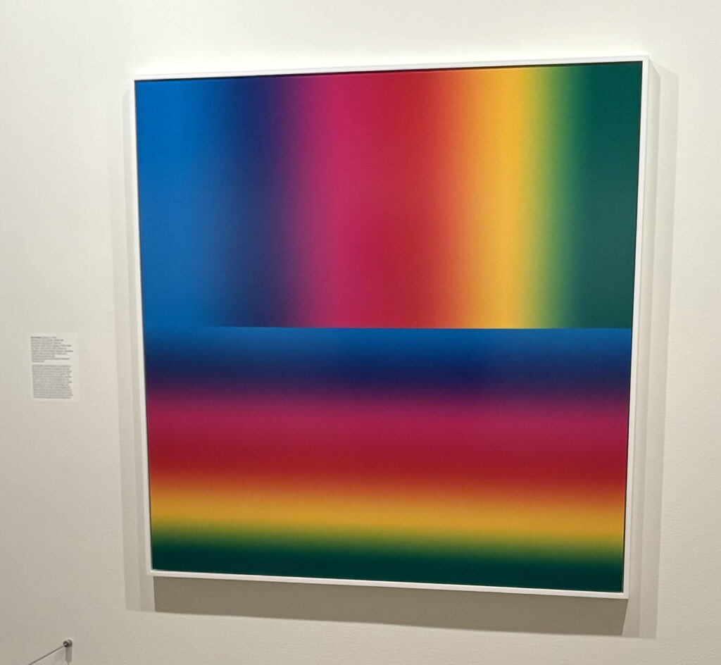
The photo above was taken at the George Eastman Museum in Rochester New York from a photographic exhibit. The saturated colors show the whole spectrum of color present in light. I love the bold, intense colors of this photograph.
White and black aren’t considered colors but are values or light taken at its brightest point and the complete lack of light.
The relationships of colors shown in these articles can applied to all types of decorating, design, and art projects.
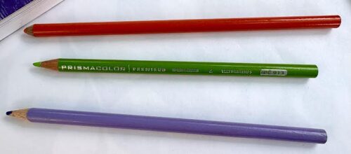
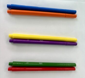
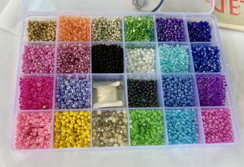
I took a few photos of some of my artist’s materials to show the basic terms used for colors:
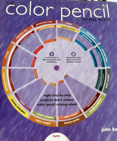

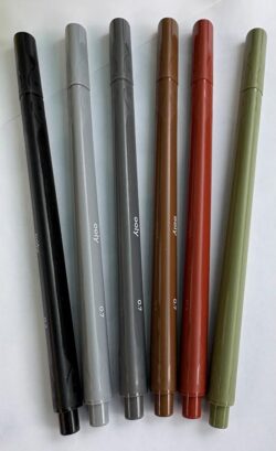

The color wheel above is a little different from the most common types. As titled, it shows how to combine basic colors to create further colors with colored pencils.
In the garden we don’t get to create the colors we use but, we do have a vast array of foliage, flower and bark colors which have been hybridized over centuries by horticulturalists and geneticists. They are the masters of the color array that we now use in our gardens. Along with nature itself, of course!
Primary Colors
Primary colors – Red, Blue and Yellow are the 3 colors that all other colors are derived from.
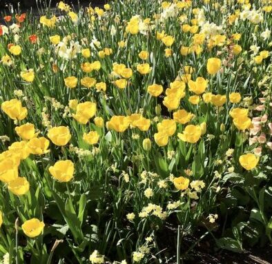
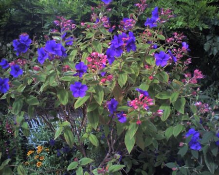
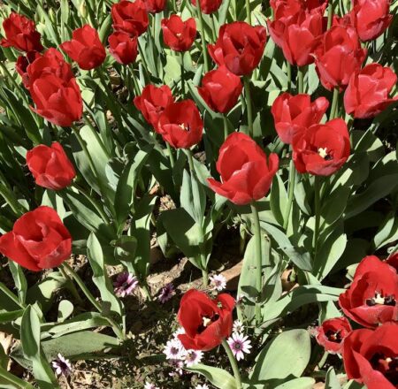
Purple flowers are often substituted for Blue, because purple flowers are often times more readily available than blue colored flowers. Pictured above are Yellow and Red Tulips and Tibouchina- Princess Flower
It is an interesting project to compose a garden that has flowers from varied shades of just one color i.e. all the many shades of blue or red. These gardens are called monochromatic.
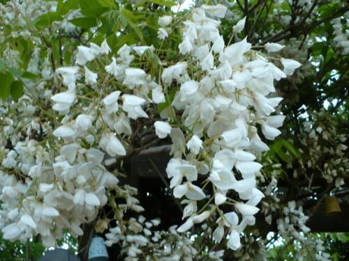
A common type of garden like this has all white flowers. These gardens reflect the light of the moon so are also called moonlight gardens. The combination of just green foliage with white flowers has a clean fresh look that is appealing.
In all gardens it is important to cut back dead flowers or “dead head” to keep the garden looking fresh. This also stimulates plants to bloom more.
Secondary Colors
Secondary colors are seen easily in the color spectrum (photo below the title at top of the page), unlike a rainbow where the colors are often muted, here the colors are intense.
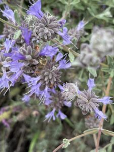
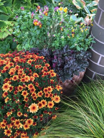
Red bleeds into Blue forming Pink, Yellow bleeds into Red forming Orange and Yellow bleeds into Green forming a Light Green in the light spectrum. These are secondary colors. In the picture above are Chrysanthemum in orange, Pansies in multi color and Purple leafed Dahlias (I think!)
Contrast and Complimentary Colors
Colors that are opposite of each other on the color wheel are known as contrast colors, and depending on how they are used, they can also be complimentary.
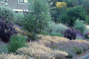
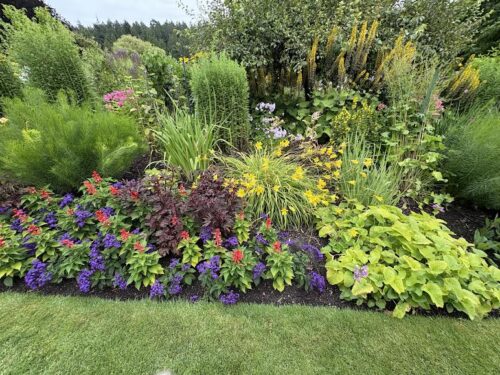
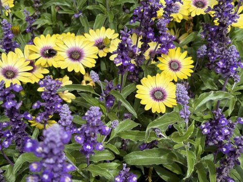
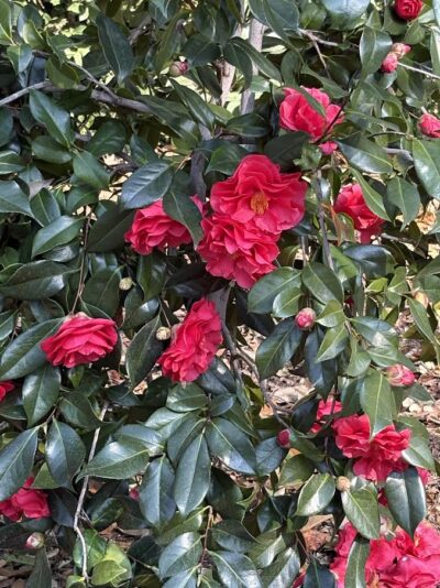
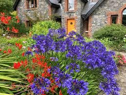
Red and Green, Purple and Yellow and Blue and Orange are used in design to offset each other while bringing out the intensity of their contrast color. In a flowering border yellow is often used a a “pop” color- a color that adds a surprise to a long row of soft colored blossoms. Pictured above are yellow Osteospermum- African Daisies with Annual Blue/Purple Salvias, Red Camellia Flowers against their Dark Green Leaves and Agapanthus ‘Midnight’ with Orange Crocosmia.
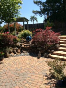
Neutrals
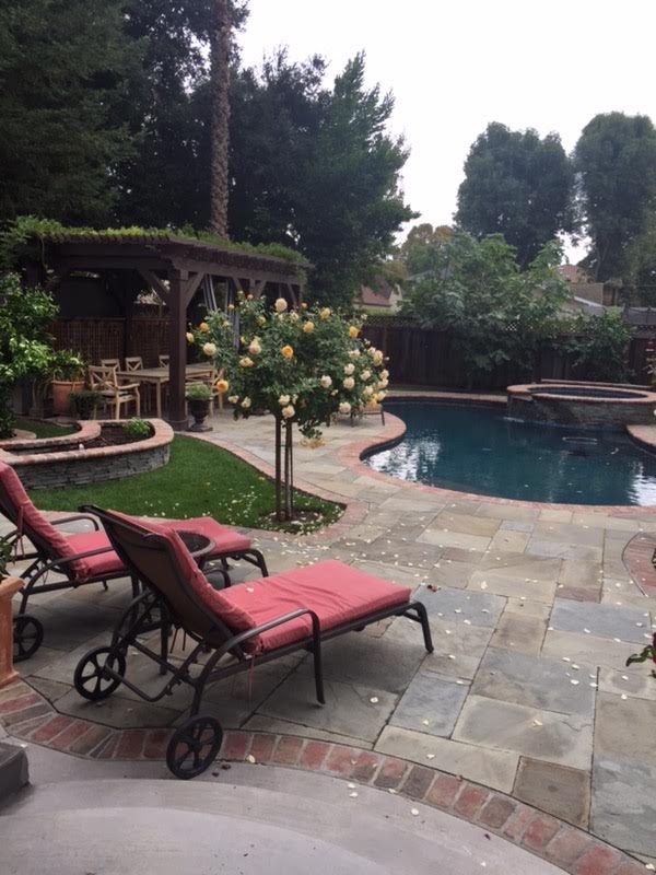
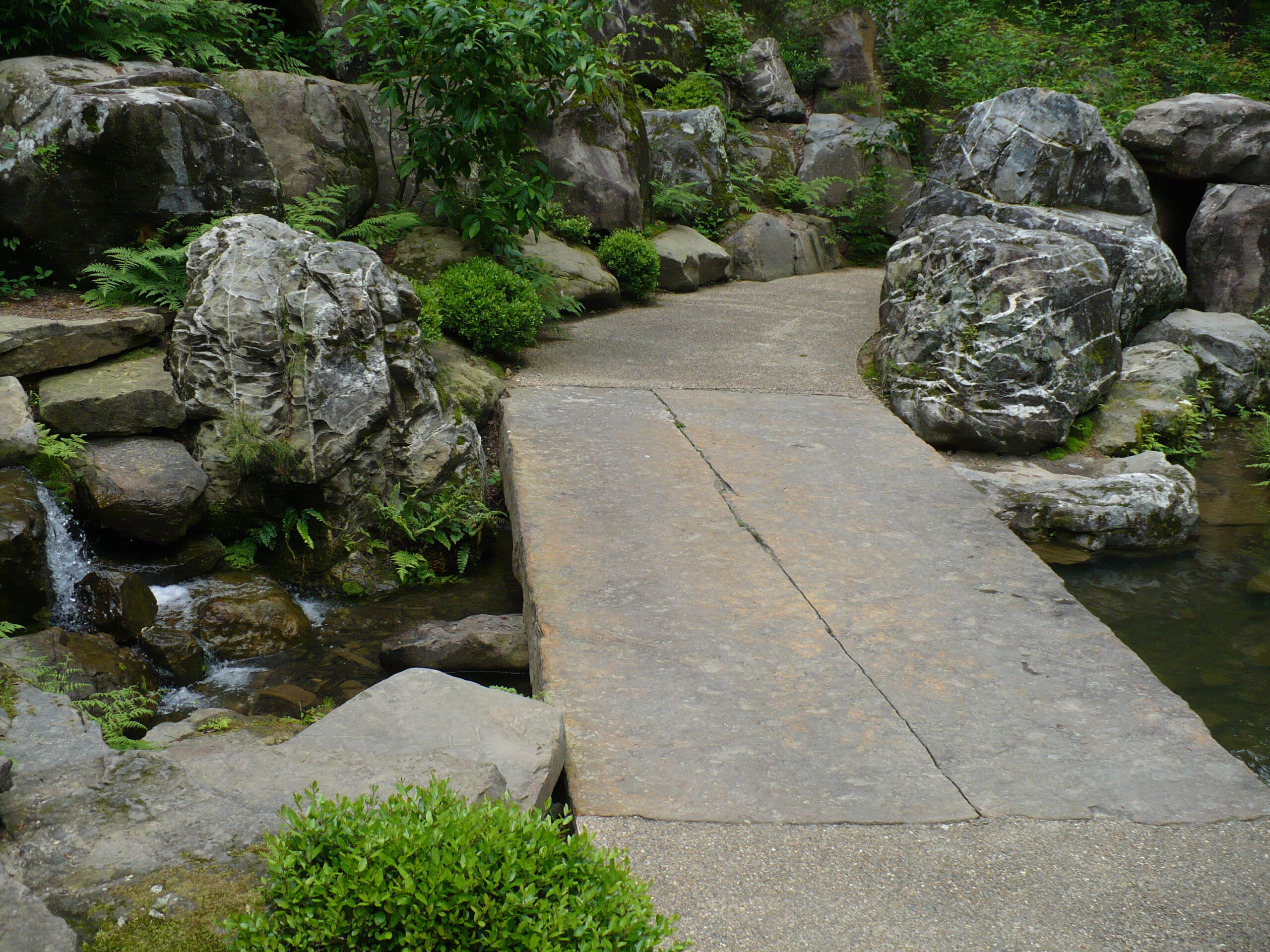
Neutrals are used as a backdrop for bright colors. In the garden, these colors are always present in the form of soil, bark, stems, stones, buildings and paving.
Black is seen in the wings of butterflies, seed casings and the deep shadows etc…but, tends not to be a common shade in outdoor spaces. Shades of Gray or Charcoal can be a great backdrop though, making colors stand out.
Life in Color
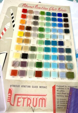
An old Mosaic Tile color chart with all the colors available to make a picture with glass tile.
This one is from the early days of my families art supply store. My Mom started the business by importing tile and teaching customers how to make mosaics, while also selling them all the supplies they needed. The store expanded to have a full range of art and craft supplies plus picture framing.
We had a whole wall of this gorgeous venetian glass tile. That can’t help but influence a person, growing up emersed in a world where using color to create all kinds of arts and crafts was at the core of everything we did. It was fantastic and when I veered off into horticulture I took my love of color, designing and combining materials with me.
This chart is good example of the range of colors that can be derived from the three basic primary colors.
The colors of the tiles are true without the influence of additional white or black. Tile, glass and glazes are pigmented with earth elements like cobalt, iron oxide, vivianite, manganese oxides, charcoal, copper, iron, chromium etc…Making the clear, deep colors.
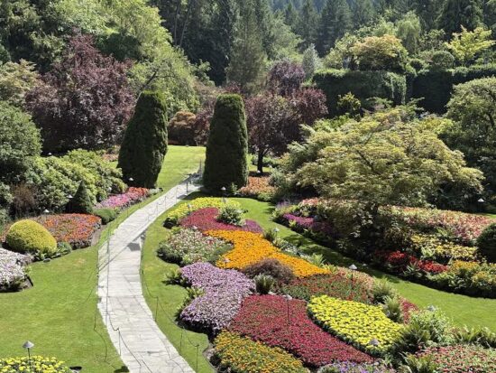
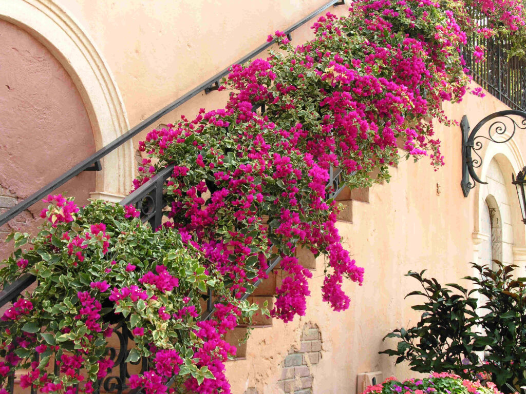
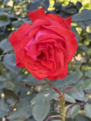
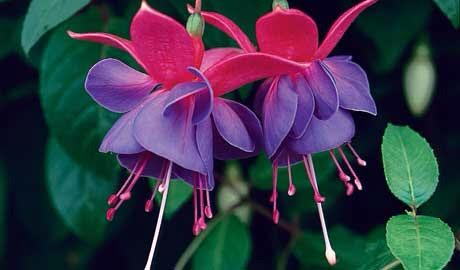
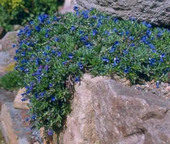
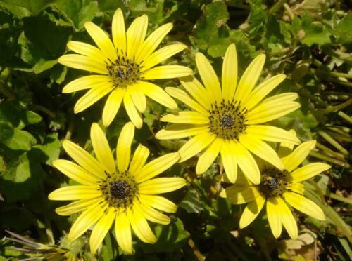
Saturated Colors
The Jewel Box Garden
Using intense flower colors like ruby red, magenta, cobalt blue, deep amethyst and saturated yellow offset by the varied greens of plant leaves in a courtyard area or small garden room forms what I call a jewel box garden.
These colors are also used in Mediterranean gardens, often beautifully set against the colors of stone tile paving i.e. travertine, peach colored flagstone or bluestone.
These gardens are vibrant and full of life making one feel emersed in deep, saturated colors. White with any combination of colors acts as a foil for the colors in the garden.
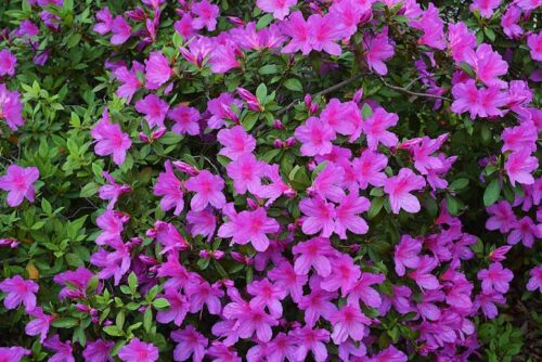
Her are a few examples of flowers in jewel tones:

Next in this blog series will be an article about pastel colors and varied shades of green.